Showing posts with label Pottery - Sunflowers (Fancy). Show all posts

Sunday, December 2, 2012

Mini Sunflower (Original, Fancy, Deluxe): Comparing Clay Bodies

Original Sunflowers (Titanium)
(All images are:
Top Left - Laguna Brown;
Top Right - RO-23;
Botom - Laguna Speckle Buff)
Any artist worth her salt is always willing to try out new materials, with the realization that there may be something even better out there to take her work to the next level. A significant portion of the final product consists of a combination of the artist's talent, skill and experience; but having the right/best materials for the job can make the difference between a good piece and a great one.

Not surprisingly and, I would imagine, like most potters, I'm rather particular about my clay bodies, considering I really only use two of them, both manufactured by Rovin Ceramics based in Ann Arbor, Michigan. For my Daisies, Calla Lilies, Jack-in-the-Pulpits, Poppies, Deluxe Toadstools and hand-painted tiles, I use RO-77, "Lite Stoneware," rated Cone 2 to Cone 10. I was first introduced to this white stoneware body when taking throwing classes at Pewabic Pottery. It is an excellent throwing body, lighter on the grog, which also works well for slab work and tiles. Furthermore, it holds the purity of the colors of the glazes I use for these pieces - Amaco's Celebration Series (and a couple glazes from their High Fire Sahara Series - Black and White), giving them a lot of punch; with a less-white clay body, these glazes look rather "muddy." I recognize the fact that any number of white stoneware bodies would do the job equally well.
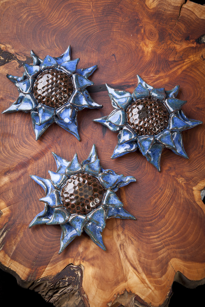
Fancy Sunflowers (Indigo Float)
For the bulk of my work, including all of my Sunflowers (Original, Fancy and Deluxe), Wildflower and Michigan Tiles, organic leaf pieces (Leaves, Applied and Embossed Leaf Bowls, etc.), lace pieces (Bowls, Crosses, Stars of David, etc.) and other work utilizing the glaze recipes I inherited from my first pottery teacher, Gene Pluhar, or Amaco's Potter's Choice Series of glazes - often in combination with Mason Stains and various oxides, I use RO-23, or Peach Stoneware, rated Cone 6 to Cone 10. With more iron than a typical gray stoneware body, it retains its "warmth" even in an oxidation firing environment. (I wish I could fire reduction - the clay's minerals express themselves even more, resulting in even deeper, nuanced results.) I first used this clay when working with Gene; he had been using a gray stoneware body from another manufacturer but was having difficulties with the supplier. After spending some time trying out other bodies, he  settled on this one. I've been very happy with the results I've gotten with it with my glaze palette; when I've used Gene's glazes or the Amaco's Potter's Choice Glazes on a white clay body, they are not nearly as rich and almost look, comparatively, pretty anemic.

Nevertheless, I'm always willing to try new things. (After a while, sometimes....) My friend Marie Colbert Gougeon, of MCG Graphics, based out of Holt and Okemos, suggested that I try a couple of the Laguna clay bodies she used in her quite accomplished work, specifically their Brown and Speckle Buff stoneware bodies. I had been lamenting to Marie about how much I missed being able to fire work in a reduction environment, with its richer results, so she recommended the Brown body because she thought it might be sufficiently darker than the Peach stoneware body I had been using. (Rovin used to make a much darker stoneware body but, by the time I discovered it, had ceased to manufacture it as one of the critical ingredients had become unavailable or prohibitively expensive.) She thought the Speckled Buff stoneware body might fun to work with.

Deluxe Sunflowers
(Albany Slip Brown)
I decided the best way to test them out would be to do apples-to-apples, oranges-to-oranges and raspberries-to-raspberries comparisons, using all three clay bodies (the Rovin Peach stoneware and the Laguna Brown and Speckled Buff stoneware) to make identical small-scale pieces in the three "phases" I generally use. So, I made three Mini Original Sunflowers with a woven pandanus coaster design, three Mini Fancy Sunflowers with a mini-bubblewrap impression and three Mini Deluxe Sunflowers with the "Starry Night" center. I bisque fired all to Cone 06.

For the Mini Original Sunflowers, I stained the centers with Burnt Umber in a water-based solution, removing the excess with a damp sponge to bring up the texture. I stained the petals using Titanium Mason Stain, again, removing the excess with a damp sponge to further enhance the pieces' dimensionality. The centers of the Mini Fancy Sunflowers were all glazed with three coats of Amaco's Potter's Choice Temmoku; I dip-glazed the petals in Indigo Float from the same series. The Mini Deluxe Sunflowers were glazed in the same way as the Mini Fancy Sunflowers except that I used Albany Slip Brown for the petals. All were glaze-fired to Cone 6.

I found that the Laguna Brown, while somewhat darker than the Rovin Peach, was not sufficiently different to warrant changing my clay body or adding another to my repertoire. (Space is already tight - I can fit about 500 pounds of Peach stoneware and about 200 of the Lite.) My photographer friend Don and I concurred that the Speckle Buff pieces look kind of... gimmicky; the speckles are actually rather distracting, failing to enhance the designs in any appreciable manner. Although I won't be changing my clay selection, based on these experiments, I'm glad I had the chance to try out some new clay bodies. I think they manner in which I approached the situation was objective and the results were easy to evaluate.

Wednesday, August 17, 2011

Fancy Sunflowers 3

In preparation for our upcoming Garden Tour and other events coming up on the horizon, I've been splitting my time between the gardens and the studio - not always easy, having two taskmasters (not to mention the four cats!)  Monday was spent getting the front garden looking pretty darned presentable; yesterday it was mostly in the studio, trying to get caught up, cleaned up and basically getting into that creative zone.

Some of the work I've been doing is finishing glazing some more Fancy Sunflowers - I've a bunch of Deluxe Toadstools I need to fire up but they won't fill a load; these will help with that.   I'm actually glazing up quite a few using one of my (and my students', actually) favorite glazes, Lustrous Jade.  As with many of the other glazes I've been using for this series of pieces, Lustrous Jade does a great job of breaking over the edges which are so much a part of these designs.  Actually, the first Fancy Sunflower I did was a Ginormous Lustrous Jade piece, just like the one in the picture at top left. I had fabricated two Ginormous Sunflowers, one with a bubblewrap center, the other using a circular woven pandanus trivet I had found at Pier 1.  Having made them and knowing I wanted to take a new direction, I talked with my friend Tim Hanks about glazing options.  He encouraged me to use the Lustrous Jade glaze, so I did.  I actually like this center texture quite a lot, as it is reminiscent of the center of an actual sunflower, with the fractal arrangement of seeds.  I also use it in my Original Sunflowers with a praeseodymium yellow Mason Stain on the petals.  Both finishes look great for this design.  I made an extra-special Ginormous Fancy Sunflower with four rows of petals in this design for my living room, along with

Some years ago,  rendezvous-ed with my friend Kathy Evans down in Southgate.  I had a bad cold (caught in a storm spun off by Tropical Storm Ivan) and had to speak at Ray Hunter Garden Center and Kathy was going to meet me to pick up some pottery.  We decided to get Japanese at Black Pine there on Eureka road but they weren't open yet, so we did the obvious thing:  Found a Salvation Army resale store and trawl the aisles.  Kathy was looking for a shallow dish to use as a bird bath and found it in the orphan "chip" portion of a chip-and-dip.  The cool thing about it was the bottom was molded to look like a big, huge hydrangea flower head.  I asked if I could borrow it, to which she consented, and made a mold of it to use for my sunflowers.  For my Original Sunflowers, I use a red Mason Stain; for this series, I thought Chun Plum was the obvious choice to evoke the intense colors often found in these plants.  I made extra-special Ginormous Fancy Sunflowers with four rows of petals in this design, as well as the Jade and Indigo, for my living room; they make an impressive composition.  (P.S.  We did finally get back to Black Pine and had a great meal of Special Miso, Edamame, Veggie Tempura and Green Tea; I went right home, slept like a log - in spite of the tea! - and felt much better the next day.)

The one piece in this series which does not use an Amaco's Potter's Choice glaze instead uses a glaze that was given to me by my first pottery teacher, Gene Pluhar.  Dark Slate was one of my favorite glazes while taking classes with Gene and it continues to be a consistent performer for my oeuvre, mostly because it breaks a good brown where it goes thin but has an amazing greeny-blue people just love where it pools; it's a good fit for the other blue/green/purple colors in this series, making it excellent for mixing and matching pieces for a larger composition.  The center on this piece is actually from another kitchen serving piece, a plastic tray I was given by my Godmother, Aunt Nancy, for Christmas a thousand years ago.  I actually get quite a bit of use out of this tray, in the studio now, carrying stuff to and from the garage where the kilns are located.  The coolest thing about it, though, is the bottom - which looks like zebra striping.  I made a plaster cast of it as well, which I use to apply texture to the petals of my poppy and dogwood pieces, as well as for the centers of some of my sunflowers.  I think of my Aunt Nancy every time I use the tray, as well as whenever I see these pieces, which is a good thing.

The final piece in this series uses Amaco Potter's Choice Vert Lustre, a relatively new formula in that range of glazes.  The glaze has a good, deep green with some lustrous mottling which is especially noticeable on larger pieces or pieces with a good deal of texture.  The key with this glaze, or with any of these glazes on these pieces, is to dip or pour if possible; brushing - even the three coats recommended - is not going to get the consistent application you need and the glaze can only move around so much when it hits viscosity in the kiln.  I experimented with this glaze, both brushing and dipping/pouring and the results definitely came down on the side of the latter.

Although it's tough to tell in this image, the center is taken from a metal grid that has regularly-placed square holes; so, when the clay slab is slapped down on it, you get a grid-like series of square projections.  It makes for an oddly-machined look which is mitigated by the overall organic quality of the design, a dichotomy I find interesting and appealing for both my left and right brain.  The juxtaposition of the very regular form of the center and the organic placement and manipulation of each individual petal creates a tension between logic and creativity, basically a metaphor for my daily existence....

Thursday, July 28, 2011

Fancy Sunflowers 2

Ginormous Fancy Sunflower, Sienna
Finally getting around to posting some more of my newest Fancy Sunflowers, from an earlier shoot with Don and than this latest on July 17.

I tend to get on these creative "tears" when an idea strikes me and then just run with it, especially trying to come up with combinations of textures and glazes, within a given piece, and then creating "suites" of pieces that will go well together.  (Because, let's be honest: one sunflower looks lonely; two looks kinda odd; whereas three together really starts looking like something.)

It was also critical to make sure I used textures that really worked with a glaze over them; anything really delicate or subtle would be lost once the glazes was applied and fired.

The piece to the left was made using a metal grid I was given by my first pottery teacher, Gene Pluhar.  The openings are oblong/ovoid, so when I drop the clay on it to get the impression, it really looks like an array of sunflower seeds, which is just perfect for the theme.  The texture is distinctive enough to take the glaze really well.  Again, I'm using Amaco's Potter's Choice Series on most of these pieces (I tend to be very systematic as well as thematic in my approach, which seems kind of weird for an artist, but I've got a lot of left brain activity going on).  In this case, in addition to the Temmoku I use for all the centers, I used Deep Sienna Speckle for the petals, as I wanted to evoke a particular variety of Helianthus annuus known as 'Velvet Queen'.

Ginormous Fancy Sunflower, Sage
I needed ten different flowers for an event earlier this summer and had only come up with eight.  Plus, I also needed another design that could complement the Sienna and Melon flowers.  So, I tried out the chair caning I received from my old friend Franklin Reed.  He was going to recover some kitchen chairs and decided, in the long run, to have it done rather than do it himself.  In the interim, however, he had purchased a piece of chair caning, which he generously gifted to me.  (Folks who know me know I'm always on the look-out for cool textures.)  Although this texture is a little "machined" for my purposes (I like more "organic" stuff, oftentimes), it was certainly distinctive enough to take the glaze for the center.  I also like the idea of using something rather commonplace (when was the last time you actually thought about chair caning, how it looks, how it's made?) in a new context.  I glazed it using Toasted Sage from the Potter's Choice series of glazes and it turned out quite nicely but I don't think it quite works with the Sienna and Melon.  So, I still needed at least one more design for the event, as well as something that would work with those two other colors.

Medium Fancy Sunflower, Jasper
One of the textures I had used for my Original Sunflowers was a paper-wrapped wire basket I found in the clearance section at my local Joann's etc.  (You can find some very interesting things in the clearance sections of your favorite stores!)  It's a little difficult to work with because the depth of the texture is not consistent, so I need to work with a slightly thicker slab (when I got around to doing the ginormous version of this piece, the center kept cracking along some of the deeper fissures) but it does make for a rather interesting, idiosyncratic, organic form and because of its irregularity, every piece really is unique; plus, there were no concerns as to whether the texture would hold up under the glaze.  I used a new (for 2011) Potter's Choice glaze for this one, Ancient Jasper, which is quite similar to Ironstone but is a bit more orangey and not quite so red.  That orange-ness plays nicely off the Deep Sienna Speckle used in the first piece discussed in this post.

So, I finally had my ten pieces, although at this point in time, you've only seen six of them.  So you know, there's more to come!

Saturday, April 2, 2011

Fancy Sunflowers 1

Ginormous Fancy Sunflower, Melon
Don was over on Thursday, March 31 (my birthday) to shoot my new Fancy Sunflowers.  After I got over my obsessive invention and production phase with the Deluxe Sunflowers (see the Teddy Bear Sunflower entry of November 30, 2010, the subject of which, by the way, was in the Green Show at the Grosse Pointe Art Center, which closed today), I started thinking of other ways to take the sunflowers to a new level.  I chose a number of the more highly relieved textures I have been using in my original sunflowers and decided to glaze the centers with the Amaco Potters Choice Temmoku glaze, as I had done with the Deluxe Sunflowers, and use really bright, jewel-tone glazes from that same series and from my own recipes for the petals.  The results are as you see here.

I only did these in the Medium, Large, Extra Large (a new size, with this series, based on the Vegetable Bowl from my stoneware dishes set, Sasaki's Colorstone, no longer in production but available through Table Tops, Etc. and other on-line replacement retailers) and Ginormous.  Although they're very distinctive, I felt that they could be "lost" in the landscape if they were too small - especially as I wanted the textured centers to be really distinctive.

Ginormous Fancy Sunflower, Turquoise
As with the original sunflowers, I find myself associating certain petal "colors" with certain center textures.  The center of the Large Frosted Melon sunflower above is achieved by dropping the clay slab on a bamboo placemat I purchased at Pier 1 (a great place to haunt for texture sources, as are the clearance areas at Joann's and Michael's - funny; maybe those two should meet...).  The flower pattern of the placemat "wants" yellow petals.  The Medium Lace Sunflower (left) is finished with Textured Turquoise.  Indigo Float (below, Extra Large Sunflower) is one of my students' favorite glazes, as well as one of mine.  It really sets off the bubble wrap texture, which looks completely different when glazed as opposed to the Burnt Umber stain I use on my original sunflowers.  The other colors I'm using include Chun Plum,  Lustrous Jade, Vert Lustre, Toasted Sage (like Frosted Melon, utterly anemic on white stoneware but quite interesting on the red), Deep Sienna Speckle (all Amaco Potters Choice) and my own Dark Slate.

Ginormous Fancy Sunflower, Indigo
The most important criteria I had for the glazes I selected was that they had to "break" over the edges of the petals.  This means that, where the glaze thins over edges as it become vitreous, takes on a different color, often influenced by the clay body underneath.  By working with a higher-iron-content body, more intense variations can be achieved.  I did two series of lace bowls - in red and white stoneware - comparing some of the glazes and found the white stoneware series, well, frankly insipid.  The red series was much more interesting and visually complex as the glazes broke over the relief created by the lace impressions.  That's carried over well into this series of sunflowers.


Don used the same set-up as we used back in January - we seem to have this down, and it really helps unify the presentation of my work.  We can slap it together pretty quickly now and just "shoot away" - I'll clear the work table and organize the pieces to be shot and assist him in moving them through the set.  The different sorts of lights he's using - one with a sparkly background the effect of which you can see on the right side of the flowers - really bring out the depth of the textures I'm using as well as the glossiness and colors of the glazes.  He'll hopefully be coming again sometime next week to shoot some of the Deluxe Sunflowers that are now coming out of the kilns - which are looking pretty damned fine, if I do say so myself - as well as the straggling Fancy Sunflowers.  I'm thinking all of these will do well in Chicago - they're certainly very rich from a design standpoint, the Deluxe Sunflowers reminding lots of folks of expensive chocolates, whereas the Fancy Sunflowers are more "flowery", which we really need with this Winter that just won't let go.