Showing posts with label Pottery - Masks. Show all posts

Tuesday, January 28, 2014

Masks: The Great Gorgon

I started taking pottery classes in January 1993, a few months after moving back to the Detroit area from a two-year sojourn in Northern California. I had always wanted to do pottery and finally found my opportunity through adult education classes offered through the local school system. The classes were taught in the instructor's classroom - he taught high school studio art, including sculpture and jewelry making; the facility was a veritable treasure trove of tools, from typical pottery equipment to drill presses, propane torches and sandblasters, most of which I eventually used.

Medusa Rondanini
I tried everything - the wheel, the extruder, the slab roller, the spray booth. I learned about making molds and glazes. I eventually made a cast of my face (with the assistance of another student) and started exploring its potential to express some of my feelings about the experiences I had had in the past few years with my family and during my marriage. Early on, I started a series of dozens of masks, the first of which was an image of Medusa inspired by the Medusa Rondanini, a piece I had studied in college and graduate school. Like a portrait of Julius Caesar I had studied during the same period, I was utterly flabbergasted at the beauty of the piece and it haunted me for years.

Medusa I
Although first mask I made was, not surprisingly, a Medusa, I didn't realize that would be the outcome when started. Utterly ignorant of the best way to pursue this particular process (I would later learn that a relatively thin - 1/4" - slab will do the trick, with some work), I shoved wads of clay into the mold, squishing them together. When the clay had shrunk somewhat, I pulled it out but twisted it a bit, which caused the wad that was the tip of the nose to become skewed. The piece wasn't what I wanted - event though I could "fix" the nose, there were significant fissures between the wads which made the face look coarse and unfinished to my eye (even at that stage) - but I realized it might make an interesting piece nevertheless - remembering the Late Hellenistic or Early Augustan sculpture. I fabricated three snakes and attached them to sinuously embrace the entire face. I finished the piece with a raku firing, using Crackle White glaze for the face and Copper Sand for the snakes.

I pursued the idea further, making three more masks, one very similar to the first, two others with the snakes more complex and inter woven (Medusas II, III and IV, left to right, above), while I was pursuing other mask concepts. I decided to try a really ambitious piece based on Athena's aegis. the goatskin that the Greek goddess of war, weaving and wisdom wore over her breastplate, on which the head of Medusa was placed when Perseus gifted her with it.

I rolled out a thick slab of clay and cut away the center to insert a mask. I added over two dozen snakes, arranged around the face but also extending out onto the slab; I hoped, by anchoring the snakes in a complex network around the face and onto the slab, it would help "knit" the piece together structurally. I also punched three holes in the slab so it could be bolted to a slab of wood for display. The piece - rather miraculously, considering the stresses inherent in its construction and its size and weight, survived the bisque firing. I glazed it as I had most of the others - Crackle White for the face, Copper Sand for the snakes. Additionally, I applied, using the Copper Sand, stars and phases of the moon across the slab.

Firing the piece was a bit of a challenge - due to its weight (very heavy), overall dimensions (a large flat slab) and construction (the mask inserted into the slab and the applied snakes). Amazingly (and this is no exaggeration), the piece survived the raku firing and subsequent smothering in combustibles, only cracking when it was laid to rest on a work table in the studio. (It would be expected that, considering the thermal stresses inherent in a raku firing - in which the bisque-fired clay is  rapidly heated to over 1900 degrees F and, even more quickly, cooled to the ambient temperature, that complex pieces would crack.)

To finish the piece, I collected the sections of the piece and glued the reassembled work to a piece of heavy canvas. Using a propane torch, I scorched a piece of scrap plywood I had cut to size with a table saw. I drilled holes into the wood to correspond to the holes I had made in the slab, as well as four additional holes to take bolts for hanging wire. I took a large piece of black window screening and scunched it up, painting areas of it with copper spray paint, and bolted that between the wood and pottery slabs. I added heavy-duty hanging wire to the back.

This piece was featured in my first solo show, at Planet Ant Coffee House (now Planet Ant Theater) in 1995, as the centerpiece of the "Girls Gone Wrong" wall.

Friday, April 12, 2013

Garden Show at Midtown Gallery, Kalamazoo

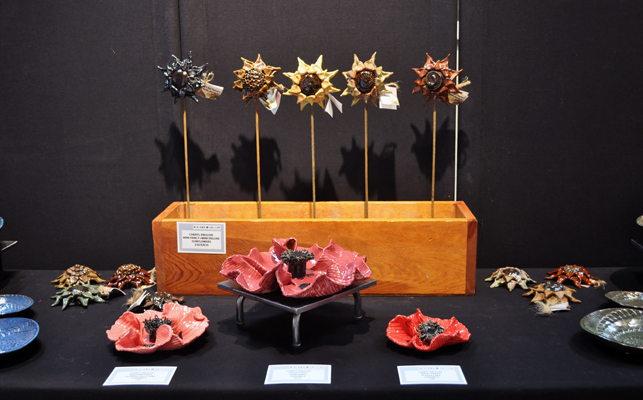
Finally got some pictures of my work on exhibit for the Garden Show at Midtown Gallery, at 356 So Kalamazoo Mall in Kalamazoo. The show is up through April 27 and there is some truly wonderful art to be seen, including metal sculpture, photography and acrylics, among other media. I love how the show was hung, so the various artists' work could complement one another. Be sure to check it out and give a shout out to Terry!

First Row, left: Eastern Cottonwood Leaf Basin (left); Eastern Redbud Embossed Leaf Bowls (right).
First Row, right: American Beech Embossed Leaf Bowls (left); Eastern Redbud Basin (right).
Second Row: Rosette Pillow Vases.
Third Row, left: Clytie (top); Large Sunflower Leaf (bottom).
Third Row, right: Clytie's Son (top); Large Eastern Cottonwood Applied Leaf Bowl with Brake Disk Charger (bottom).
Fourth Row: Lace Bowls (far left and far right); Poppies (front center); Mini Sunflowers (back center).
Fifth Row, left: Deluxe Large, Extra-Large and Ginormous Words Sunflower Installation.
Fifth Row, right: Scrolled Libation Bowl with Stand.


The Seven Deadly Sins: Gluttony - Part 4

It was time to "put it all together". I had everything done (except the door pulls, which were being glaze fired) so I decided to go ahead and assemble what I could. First I laid everything out - the cabinet and its doors and hardware, the mask and the nameplate and three drywall screws.

When I first started working on The Seven Deadly Sins concept, I had made some name-plates for the seven cabinets, rolling out a slab of clay, using my Poetry Stones Kit letters to stamp out the seven sins and punching holes for screws to affix them to the cabinets when the time came. I had finished these by reserving out the letters and glazing the rest with crackle white glaze and raku firing them; they had been in storage for over ten years, waiting for me to finally get back to the project.

I had also thrown a doorpull master all those years ago, of which I finally made a bi-valve mold this Spring. After making two casts from the mold and letting them harden a bit, I incised them with what I hoped might look like a rotting apple (if you really used your imagination) and made holes to take threaded inserts for screws to affix to the doors. I bisque fired them to Cone 06. After firing (and determining that they would work with the inserts), I applied black glaze to the tops, pulling off the excess so the glaze only remained in the incised areas; then I glazed all but the bottoms with my Pearl White glaze - tying them back to the nameplates I had made all those years ago.

My first step was to attach the doors to the rest of the cabinet using the tiny little hinges my handyman/friend Keith had given me. Then, using black drywall screws (which looked perfect with its raku finish), I attached the nameplate at the top center inside the cabinet. I had to do this very carefully because the plaque was not perfectly flat and if I screwed it down too tightly on both sides, it could easily crack; so, using a small cordless screw driver, I worked very slowly and checked frequently to make sure it was tight but not too tight. The screws were much too long, of course, so I marked them after I drilled them in, then took them out and cut them off using a pair of bolt cutters. This way, they firmly held the nameplate in place without extending beyond the back of the cabinet, which would have created considerable problems when installing the piece.

With the cabinet sitting up, I figured out where I wanted the mask to sit, then measured how far down from the top of the mask the wire would stretch when the piece was hung inside the cabinet. Measuring to the center and then three inches down from where I wanted the top of the mask to rest (the distance between the top of the mask and the wire), I drove another drywall screw in at an angle. After making sure I liked how the mask was oriented, I took out the mask, removed the screw, cut it down so it would not extend beyond the back of the cabinet, then replaced it.

When the doorpulls were fired and cooled, I placed them on the outside of the doors. I marked and drilled holes, then put the screws through and put the threaded inserts on them. After making sure that the doorpulls were going to look right and work correctly, I filled both with epoxy and put the over the inserts and screws, making sure the "rotten apples" were correctly oriented.

I thought the piece was "done". I was actually pretty happy with it - the contrast between the innocuous exterior and the excess of the interior was working for me. My best friend, Catherine, came over to go out to lunch (she had generously offered to treat me to celebrate the successful refinancing of my house here in Detroit) and she was the first person to see the finished piece. Despite the fact that she protests that she lacks any creativity, Catherine made the suggestion that I put a knife and fork at the bottom of the piece to balance the nameplate at the top, further suggesting that they be crossed so as to be reminiscent of the crossed bones indicating "Poison". Since we were going to the local diner to eat, I asked our waitress (and friend) if we could buy a knife and fork. Although it isn't in any of the pictures here - we dropped the piece off for jurying for the Grosse Pointe Art Center's "Food for Thought" show right after we finished eating, it really finished off the piece.

Keep your fingers crossed that the piece gets in the show. I actually feel it's one of the best pieces I've ever submitted. The description of the show refers to our "ambivalent relationship with food" and I think this piece does a decent job of capturing just that.

The Seven Deadly Sins: Gluttony - Part 3

When I first started thinking about this concept for the Seven Deadly Sins, I had picked up a few of the small wooden boxes that are designed to hold a few bottles of wine at some of my local markets. They all still had their "lids" - usually two roughly evenly-sized boards - which I felt could easily be adapted into cupboard doors. One of the first things I did once I decided to proceed with "Gluttony" was to contact my handyman, Keith, and asked him to hinge the "doors" and make the box so it could hang.

Well, Keith did that and more. In the intervening years, the boards had warped, so he took the back off the box, used the boards as a new back, and hinged the still-(relatively)flat boards as the new doors. Using almost unimaginably small hinges as well as some picture wire and small staples, he set me up.

I knew I wanted to use pictures of pasta dishes for the inside of the cabinet. I found an Italian recipe magazine at my local market that had photos of 13 pasta dishes; unfortunately, the photos were almost all back-to-back, so I had to get two copies of the publication - at $12.99 a pop (the things we do for our art). But the pictures were exactly what I wanted.

I stained the entire exterior, all of the edges and the inside top and bottom of the cabinet using Minwax Ebony Stain. Once it was completely dry (and the house aired out), it was time to work on the interior. I tore out all the pasta recipe pictures (I didn't want to cut anything because I wanted to have the softer torn edge), then - using a good metal ruler - tore off any excess white space in the images; I wanted as much of a riot of color as possible inside the cabinet. I roughly placed the pictures I wanted over the doors and inside the cabinet (I wanted pictures with red sauces to be more prominent to pick up the colors in the mask) and started applying them using Mod Podge, a product I remembered from my childhood.

In the process, I discovered it was best to apply the Mod Podge to the paper using a one-inch-wide flat brush, flip it over and apply it to the desired surface and then move it into position. Using a barely-damp sponge, I smoothed the paper (as much as I could on a very rough wood surface), pushed the paper it into any corners and removed any excess Mod Podge from previously applied paper surfaces.

I did the doors first and let them dry completely before trimming them with a sharp knife - I wanted to carry the excess over into the inside of the cupboard. Because the doors were a bit longer than the interior (in order to completely cover the box), I trimmed the bottom and top images off to register as closely as possible when the doors were opened. I had one extra image, which I tore into quarters and applied randomly inside the cabinet. Then I let the piece dry over night.

It was time for final assembly.

The Seven Deadly Sins: Gluttony - Part 2

Mask, Bisque Fired
Due to my own anxiety, I had bisque-fired the mask on its own in the small kiln - I was really uncertain it would survive, even though I had been very careful in fabricating it. Luckily, all was fine.

Once the mask had cooled sufficiently, I brought it in and started glazing it. I knew it was going to be a multi-step process: glaze sauce (three colors); wax resist pasta and sauce; stain (and nuance) meatballs; wax meatballs; finally, glaze the rest of the face.

Working methodically, I applied three coats of Amaco Celebration Series Scarlet Red to all of the sauce areas (photo below, left). (It helped that I had other things to do in the studio, including glazing some ladybugs on a commission toad house Scarlet Red and Black, it also helped that I had a fan I could put on the piece to speed up the drying, as well as the fact that I had forgotten an appointment, which gave the piece additional time to dry between coats.) I knew I didn't want the "sauce" to be the same color - nothing is really all the same color, after all. So, after applying the Scarlet Red and letting it dry completely, I added dabs of Burgundy from the same glaze series (photo below, center) and, finally, dabs of Clementine, also from the Celebration glaze series (photo below, right).


Mask Waxed
Next, I applied wax resist to all the areas of "pasta" and "sauce" to minimize the chances of their getting the other (much darker) stains and glazes on them. I tend to use the wax resist from the jug at a 1:4 ratio with water. Thicker wax resist is harder to apply precisely and takes a very long time to dry. Thinner wax resist can provide less protection if it isn't allowed to dry completely, so I often put my waxed pieces in front of a fan or under the heat vent in the basement (if the heat is on).

Mask Glazed
Once the wax was completely dry, I applied a water-based Burnt Umber solution to the "meatballs" using a very small brush (the space was very tight, as I had applied "pasta" over some of the "meatballs") and, as much as I could, removed the excess using a damp sponge, a technique I have used to great effect on many of my "leaf"pieces for nearly 20 years. By taking even a bit of the stain or colorant off with the sponge, nuance is added to the piece, generally to positive effect.

Mask Glaze Fired
After having waxed the "meatballs" and allowed the wax to completely set and dry, it was time to glaze the rest of the face. I had had Glazemixer.com make up some small batches of some glaze recipes I was given my my first pottery teacher, Gene Pluhar, including a glaze called Matte Black Brown. This glaze is actually intended to be used in a Cone 6 reduction environment (I fire Cone 6 oxidation) but I really liked the glaze's irregular pitted surface in my firing conditions and figured I might have a use for it at some time in the future. I thought it would be an effective finish for the "skin" on "Gluttony" as I wanted to convey the sense of having eaten to such excess that the image was irretrievably corrupted. Again, using a very small brush, I applied the glaze (rather thickly) over all exposed areas of the face. (I did miss one area, but I'm not telling where....)

I fired the piece on a four-hour cycle at Cone 6 on four stilts. I was delighted when I opened up the kiln and saw the final results. "Gluttony" was shaping up very nicely....

The Seven Deadly Sins: Gluttony - Part 1

James's Face
Over 15 years ago, after my Dad died, I started working on a concept relating to the Seven Deadly Sins. At the time, had been doing a lot of work with series of masks; I had even had a one-woman show at Planet Ant Coffee House (now Planet Ant Theater) in Hamtramck consisting solely of the masks I had created in the three years of pottery instruction I had had at that point in time.

I'd be fooling myself (and no one else) if I thought there was no correlation between my father's recent demise and the birth of this concept. I was in a pretty morbid (in a lot of ways - personally, professionally, psychologically) place in my life - and what does any artist do with that sort of stuff?

Anyway, I started working on this idea in 1996, while I was working at a place called IRI, where I met my now-good-friend James, who was the company's IT person and, in addition to being rocky smart, culturally attuned and utterly devoted to his family, weighed, well, quite a lot at the time.

Part of the Extruded Pasta and Meatballs
James, being James and possessed of a wide-ranging creative sensibility, provided a useful counterpoint to my musings on what was going to be a very big piece - eight (yes, that's right - eight) cabinets with doors (so-called to tie in with the classic 1920 film, The Cabinet of Dr. Caligari) made using recovered wine crates (the kind that hold four or so bottles of wine). The entire piece was actually an installation, to be honest. I had already decided that I would stain the exteriors all of the boxes black (or ebony) so they would look relatively uniform and innocuous on the outside. I also planned to make my own door pulls featuring hand-incised images of momento mori (iconographical reminders of death, such as an hourglass, clock face, extinguished candle, fading flower, rotten fruit - you get the idea). I planned to decoupage the inside of each cabinet with pertinent paper-based imagery and affixe a raku "nameplate" inside at the top of each one, above a mask conveying that particular vice. Some of the pieces were more challenging to conceptualize (and some still are); others were relatively easy.

The Pasta Finished
One day, James and I were discussing what I could do with "Gluttony". I wanted a strong contrast between the plain matte black stain of the exterior of the cabinet and thought a collage of pictures of pasta dishes - with their strong colors and textures - would work. James (who weighed over 400 pounds at the time) chimed in that I should use the face of a really fat person (he was not disingenuous about his physique) for the mask and put pasta, meatballs and sauce all over it. I observed that I didn't know any fat people, which was met with a look of mingled affection and exasperation.

Needless to say, I did make a cast of James's face; you can see the piece I pulled from it in the top picture here. I went ahead and used my Rovin RO-23 Peach Stoneware for the face itself because I planned to use an opaque glaze from my first pottery teacher and I prefer this clay for most of my work. I also planned to use that clay body for the "meatballs", as I planned to stain them using Burnt Umber, for a different type of matte finish. After cleaning up the face and putting in holes from which to hang it once the piece was finished, I began the process of adding the "pasta", "meatballs" and "sauce".

The Mask, Completely Fabricated
Because I didn't want to have to glaze the "pasta" and wanted to be able to use glazes from the Amaco celebration series for the "sauce", I decided to use Rovin RO-77 Lite Stoneware for those parts of the composition. I used my Mini Klay Gun extruder with the largest die for the pasta, having scored the face underneath. Once I got a good "base", I rolled meatball-sized balls of Peach Stoneware on burlap to give them some texture, cut them in half and applied them to the face, then added more extruded White Stoneware, this time scattered over the entire face.

The final touch was going to be the sauce. Using a pastry knife, I slung clumps of semi-liquid white stoneware slip slip at
the mask, randomly hitting it all over the pasta and exposed "skin". I made quite a mess all over my work area (including the floor) but I loved the effect - it conveyed the unbridled energy I was driving for as successfully as I could have wished.

Once I had made sure the hanging holes had not been covered in the fabrication process, I set the mask to dry, then bisque-fired it to Cone 06. Now it was ready to be glazed. I had been (relatively) careful about documenting the process, partly to include on this blog but also because I wanted James to see what I had done with his face. I actually saw him later on the day I fabricated the mask. He had had surgery in the intervening years and it was truly amazing to see how great he was looking - and he liked what I had done with our concept.

Tuesday, December 25, 2012

Green Man: Winter

Green Man - Winter: Gene Pluhar
I think most of us have heard (or, perhaps, even used) the phrase "Old Man Winter". While the face I used for Winter in my Green Man/Woman series is not of what I would call and "old man", it is definitely the face of an "older" person, a quality further conveyed by the face's beard. I was able to acquire a facial cast of my first pottery teacher, Gene Pluhar, who - at the time (and likely still the case now, although I'm not certain) - had a full beard and mustache. I had originally planned to use his face for a wall fountain idea I had (and may someday return to) featuring a face of Poseidon, Greek god of the sea. Using his face for Winter was a logical progression.

I used a couple of techniques to convey the sense of the coldest season in this mask. No ladybugs, obviously, and instead of having no acorns or immature or ripe acorns, I made some acorn caps to add to the tips of the three "branches". I made a small acorn nut, which I then fired and keep in a safe place (it's very easy to misplace) and I form the caps over it, as the wet clay will not stick to the still-porous bisque-fired "nut". The caps are carefully attached (remembering they can easily collapse if pinched too tightly) as the full acorns were attached in the Summer and Autumn masks, by gently scoring one section of the cap, slipping it and then attaching it securely.

Detail of acorn caps
When deciding where the branches go on all of these faces, I often use the mask's brow as a guide, using the branch to "echo" the eyebrow or the brow ridge. I usually only use two branches in these compositions - one on either side of the face, one of them arching up over the eyes onto the forehead - but because there are no leaves to "fill in" the Winter composition and it looks excessively bare with only two main branches, I decided to include an additional "sub-branch" to fill in some space high on the forehead. The placement of the branches in relation to the hanging holes is more critical in this design, as there are no leaves to further mask them; in this case, I used a cluster of acorn caps to help conceal the hanging hole and wire on the left side of the face, while a branch was sufficient on the right.

I also wanted to create the sense of "frostiness" on the face, including the facial hair (beard, mustache, eyebrows) and the upper surfaces of the branches and caps (frost usually hits the top side of an object first). In the first few iterations, I used Amaco Sierra High Fire Glaze White, but was not entirely satisfied with the results - they weren't quite "frosty" enough. In working with Crackle White raku glaze, I had learned that most white glazes are not at all opaque but are, rather, translucent, so that they pick up some of the color of the underlying clay body. Because I was using a reddish clay body (to give the faces some natural warmth), the white really wasn't coming up "white" but kind of pinkish.

Detail of eyebrow and branch
My eventual solution was to brush white stoneware slip on the places I would want to be frost after finishing fabricating the piece before it was dry. The downside of this is I must make some of my glazing decisions before the piece is even bisque fired, but it has worked well: the "frosty" areas actually look pretty white and... frosty!

Once again, I use Burnt Umber to stain the branch and caps. I am very careful in applying and sponging it off so as not to get it on the "frosted" portions; it's nearly impossible to remove all stray oxide should that occur, thereby minimizing the impact of the "frosting". (Additional white slip cannot be successfully applied to the piece after bisque firing - it will not adhere.) As with the other masks in this series, this piece can be glaze-fired on a raw, untreated shelf, as there is no glaze near the bottom edge to vitrify.

Although it took a few years and several experiments to get this design "right", I've been very happy with my solution to the "frostiness" issue and, having resolved that issue satisfactorily, I later went on to create one piece incorporating aspects of all four seasons.

Green Woman: Autumn

Green Woman - Autumn: Cheryl M. English
Although I seldom use my face in my work, I decided to use it for the "Autumn" mask in the Green Man/ Woman series because the scale is similar to that of the face used for Spring (my friend Tia Nero) and I really like the Fall palette of colors - I am definitely a "Fall" in terms of my coloring, so I suppose there's a certain degree of synchronicity at work here as well.

One issue with the mold for my face - it has deteriorated a lot in the last 15-plus years and I can't make another. In that time, I have developed a sufficiently severe case of asthma that I am no longer comfortable having my entire face encased in plaster, forcing me to breathe solely through two straws inserted in my nose, although I'm entirely capable of breathing exclusively through my nose under "normal" circumstances. My friend Catherine tried twice to make a new cast and, after our second attempt, swore she was never going through that again! The cast I have is the cast I have, despite its decline; I've simply learned some strategies to minimize the evidence of its deterioration.

Detail of "knot" at base of chin
For the Autumn mask in the Green Man/Woman series, I decided to use Red Oak (Quercus rubra) leaves, to play on their relatively intense Fall color. I follow my general routine in preparing the mask in terms of casting, cleaning up and making holes for hanging the mask once complete. You'll notice on a lot of these that the portion of the mask above the forehead is often roughly broken or torn, in keeping with the naturalistic aesthetic I follow in much of my work, in which I try not to "overwork" the clay; I am, however, very careful to make sure the sides of the face and the chin are trimmed in such a way that they should lay roughly flat against the wall (or other surface).

I prepare the branches, rolling out coils and adding texture, then affixing them to the mask with a "knot" where they are joined under the chin. I find the pad of my thumb or one of my fingers is effective in not only making the final "join" for this step but also make for a very naturalistic appearance; I have often been asked how I put the "wood" on the clay, so I am successfully conveying the "idea" of an actual wooden branch in the pieces in which I use this technique. (Some folks react to the manner in which I drape my clay in some designs by thinking I must be working with leather!)

Detail of acorns
I select, fabricate and apply the leaves as in the other Green Man/Woman masks, using Red Oak leaves I easily find in my Detroit neighborhood. (Quercus rubra was one of the five trees the city used as street trees before the onslaught of the Emerald Ash Borer essentially extirpated all the ash trees in the city; now they are planting a greater variety of trees in a more random arrangement, rather than having whole streets plante with an arboricultural monoculture.) These can be a little tough to work with in the glazing process with their pointed lobes but I think, between their form and color I use to stain them, that they make an excellent contrast to the White Oak (Quercus alba) and Swamp White Oak (Quercus bicolor) leaves I use for Spring and Summer (respectively).

For the acorns, I use the same process as I use for the "immature acorns" I make for the Summer mask, just making the actual nut a bit larger to convey its maturity and proximity to ripeness. The acorns are plump and the caps don't fold down around the "nut" as much in the Summer acorns. They are fabricated and attached in exactly the same manner, just using more clay for the "nut". 
Detail of ladybug

I also usually include a ladybug on these pieces as the ladybugs are still active well into the Autumn. I also really like the contrast between the glossy glaze I use for the ladybug and the matte finish on the rest of thee pieces, including the untouched clay of the faces, which can show every "blemish" and "imperfection", which I think only serves to make these pieces even more visually interesting. I do admit to following some of the 17th century in placing the ladybug, such that it fulfills the role of a strategically placed "beauty mark".

Once the piece is bisque fired, I finish as with the other masks, using Hazelnut Mason Stain instead of Spring Green or Green-Ivy on the leaves. I like the warm reddish quality to this stain, which makes a great complement to the greens of Spring and Summer and the even more subdued palette I use for the final, Winter, mask in the series.

Monday, December 24, 2012

Green Man: Summer

Green Man - Summer: Jose Vasquez
In creating the Four Seasons Green Men and Women, I had decided I wanted to use various faces to make up the series, faces representing different genders, different cultural background and different ages. I opted to use the cast of Jose Vasquez for Summer. Jose was one of my friend Jeanne Galloway's stock brokers who bravely allowed us to make a cast of his face. I like working with Jose's face because, although his features are very, very strong (as compared to the delicacy of Tia's features), they are, once again, completely balanced, from a strong brow and full, sensual lips to a unique aquiline nose, helped along by a stint as a bouncer.

Jose's face is, like many men's faces, much larger than Tia's so it could handle larger masses easily. I opted to use leaves from the Swamp White Oak (Quercus bicolor) for the Summer Green Man, with less deeply-cut lobes. In order to distinguish it from the other faces, I used a deeper green and added small, immature clay acorns.

Detail of Acorns
I follow the same process as for the Spring mask in terms of preparing the piece - casting; placing holes; applying branches; selecting, fabricating and applying leaves. To create the acorns, I roll out a rather thin slab of clay and, using a half-inch round Kemper Klay Kutter, cut out an odd number of circles, which I roll into balls. I lay a piece of burlap over the rest of the slab and roll it in to make some texture, then cut out an equal number of "caps" using a half-inch rosette Kemper Klay Kutter. Scoring and slipping the underside of the "caps", I secure them to each of the acorns, pushing the outer edges of the rosettes down securely. I then score and slip one section of each of the caps and attach them to the mask at the ends of the branches. I also sometimes include a ladybug on these pieces as well, as they are "seasonally appropriate".

Once bisque fired, I glaze the piece in the same manner as the Spring mask, with the exception that I use Green-Ivy (a deeper green) for the leaves and for the (immature) acorns, staining the caps with the same Burnt Umber used for the branches. The piece is fired as usual, the wire attached and it's ready to go!

Sunday, December 23, 2012

Green Woman: Spring

Green Woman - Spring; Tia Nero
When I first started working with pottery, I had already had some studio art experience during my undergraduate days, when I did an Honors College project on lost-wax bronze casting. One of the pieces I made during that project was a mask of my boyfriend at the time, made from a plaster cast I had made after my friend Tim Mason showed me how. Although I am no longer with that boyfriend, I have kept the mask as it was actually quite successful

When I started the pottery in 1993, I soon returned to the mask motif, often influenced by my background in Art History and Archaeology. Natural motifs were also an important influence - as the offspring of a family of gardeners, plant themes and forms were a continual inspiration to me. I made some masks in which I pressed the clay into the mold, having placed leaves or flowers in it first; others involved applied decoration made using leaves. These last eventually evolved into my four-season series of Green Men and Women using leaves from native oak tree species and the faces of friends and acquaintances.

I wanted to retain a certain degree of botanical "truth" with these pieces, using seasonally-appropriate details and colors. I also wanted to have a certain degree of variety in the faces used, including gender, cultural background and overall features. The faces I enjoy working with most seem to have fairly balanced features, as well. There is also a definite synchronicity to my work, relating to everything from the leaves I associate with certain seasons to the stains and glazes I relate to different plants. This all comes into play with the Green Man and Woman faces.

When deciding which face to use for Spring, I found the delicacy of my friend Tia's features made for a rather fragile strength, which seemed to me perfect for the image of Spring. I opted for White Oak (Quercus alba) leaves stained in my own proprietary "Spring Green" Mason Stain (50% Titanium Yellow plus 50% Green-Ivy). I also decided to include a strategically-placed ladybug for a little additional color.

When creating these masks, I follow the same process for making the life cast and pulling the clay cast from it. I trim the back edge to get the desired "angle" for the way the face will hang and put holes for wire at about the point of the outside corner of each eye. Then, I roll out coils of clay for branches and, slipping and scoring these, apply them, wide end at the chin, framing the face, one usually ending above the eye on one side, the other up onto the forehead and over most of the brow. I join them together under the chin in a twisted "knot", making sure they will not pull away from the mask.

Detail of leaves.
Having selected a number of leaves (I try to use an odd number over all and select extras to allow for variations and to have a choice in the process), I roll out a relatively thin slab and, having removed the canvas surface with the flat edge of a metal kidney, roll them into the slab and cut them out with a very sharp tool. I try to have a range of sizes, keeping in mind that a smaller face needs smaller leaves overall. Having cut them all out, I start to play with arranging them on the branches on the face, working from largest at the bottom of the branches at the chin to smallest at the tip of the longer branch. Once I arrive at a satisfactory arrangement, I score, slip and attach them so larger leaves overlap smaller ones.

I sometimes use half-inch posts to support the leaves so they don't drop down to the plane of the kiln shelf on which I'm fabricating the piece, thereby minimizing the risk of breakage further on in the process. If I'm producing a number of these pieces, I'll often do so on large kiln shelves, creating two or three on a single shelf with an individual piece of newsprint under each one, so I can easily move them around without disturbing the individual pieces used to create a given work. I apply the leaves and branches so as to make sure the wire used to hang the piece will not be visible when it's completed.

Detail of Ladybug
I use four tools to make my ladybugs: a half-inch round Klay Kutter to cut the piece of clay out, which I then roll into an oval shape and then press lightly onto a flat surface to flatten the bottom; I use the curved end of a Kemper B-3 Clean-up Tool to make a line differentiating the head from the thorax; I use the back of a fettling knife to separate the back into the two wing cases; and I use the circular end of a small, inexpensive paint brush to put a spot on each wing case. I score and slip the underside and then attach to the mask.

After bisque firing, I apply water-based burnt umber solution to the "branches" and pull off the excess with a damp sponge. I then apply Spring Green Mason Stain to the leaves, following the same process. Three coats of Amaco Celebration Series Scarlet Red on the ladybug's thorax are followed by two coats of Amaco Sahara Black for the head and spots. Because there is no glaze on the piece except on the ladybug, it can be glaze fired on a clean, untreated shelf, to Cone 6.

I really enjoy these pieces, although they are a great deal of work, from collecting the leaves to the intricacies of the fabrication and glazing processes. I actually sold a set of four to one person who planned to hang them from the trees along her horse-back riding path - I thought that made for a great idea!

Monday, April 9, 2012

Sunflower Masks 6: Petals

The final design for the Clytie masks I've created is what I call "Petals", because I use additional tiny petals as the "accent" for the piece. This idea actually derived from my training as an (Advanced) Master Gardener, where we learned that the family of plants to which the Sunflowers belong (formerly known as the Compositae, now known as the Asteraceae) are characterized by a flowering body made up of two types of flowers - ray flowers, which reside at the perimeter of the flower and characterized by showy petals, and disk flowers, which are much less conspicuous and take up the rest of the flower head. The sequential blooming of the disk flowers explains the ongoing visits by pollinators and, therefore, the fact that these types of plants are a highly valuable resource for our native pollinators.

I decided to take this idea in a slightly different direction, by creating additional petals to accent the faces for these masks. I fabricate the mask as usual, using the two rows of petals (Medium and Tiny Sunflower outer petals for the smaller, more delicately structured female face; Large and Small Sunflower outer petals for the larger, stronger-featured male face) around the perimeter. Then I used the Tiny Sunflower inner petal cutter to make additional petals that I then attached in a manner intended to accentuate the face's inherent structure.

After bisque firing as usual, I glazed using Burnt Umber for the face; I applied Titanium Mason Stain for the entire surface of all the petals and then brushed Orange Mason Stain for just the tips, as I had for the previous post on the masks. This makes for a brighter yet more subtle color combination folks really seem to like.

To finish all of the masks, I use a type of wire I can only seem to find at Lowe's, of all places - a plastic-coated 30-lb picture wire by Ook. I like to use this product because it is less prone to rusting due to the coating; I could use stainless steel wire instead, but it is quite a bit more expensive. I loop it through the holes in the back of the mask and twist securely. These pieces are considerably less than 30 pounds, so I'm not concerned about the wire failing. (I'm not so much buying the wire for its rating as for its coating.)

This is the design I used for the mask of my best friend, Catherine which appeared in a picture taken of me for an article about the Clematis in my garden published in Michigan Gardening magazine in July 2009. I so like this photo - because it incorporates two of my three loves (the other being my cats, of course!) - my garden and my pottery. You can also see three more of the masks I've made of myself and my "sibling friends" (there are nine altogether now, including Carla, to the left of the photo, and Nancy, in the distance to the right; I'm in the back to the left; Sue Ann, Tia, Sharon, Debbie and Stephen are out there as well), all of which stay outside on their posts all year long so I can always visit with my family. (The Clematis is Clematis x 'Barbara Jackman'.)