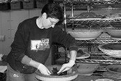
I mix the powdered materials with enough water that they don't clump up on the brush. I don't want to put them on really heavily - it's more of a wash technique I'm using. I use Burnt Umber for the face, making sure the entire surface is covered. The solution dries almost immediately, as the clay is dry from the firing but still porous. Then, using a moistened (dip it in water, squeeze it out) typical synthetic pottery sponge, I take most of the color off, bringing up the face's detail. Then I apply the color for the petals, front and back. (Not everyone might see the necessity of doing the back of the petals, but I realized a while ago that, if I cover everything, I'm not going to discover, pulling the piece out of the glaze firing, that I've missed a critical spot that will be visible when someone looks at the piece.) Again, I use the sponge to remove some of the color from the edges and tip of each petal, to enhance their dimensionality. If the solution is applied to thickly and not removed sufficiently, it can flake after firing - the clay can only absorb so much of it.
When glaze firing, I load these pieces directly on a clean, bare shelf (same as I would use for my bisque firings - I have separate shelves for each, which simplifies my maintenance process). Because the stains don't vitrify, but rather fire into the clay body, I don't have to worry about sticking to the shelf, or any other stained piece in the load - so these pieces can be loaded more densely than traditional glazeware; I even stack my Original Sunflowers. (They sometimes stick together because of the clay's reaction to the heat, but I can usually - 99+ percent of the time - get them apart carefully once they've completely cooled.) The petals can "relax" a bit in the glaze firing so I sometimes use posts to keep them "up", but usually I don't bother.
The last design I came up with for the Clyties (although not the last I'll share here) came of the fact that I was making a series of these of my sister/sibling friends for my garden and wanted as much individuality as possible. A lot of the pieces have a "serious whimsy" about them - fantastical in subject but pretty straight in execution. This design was a bit different, from start to finish.
 This design is probably the direct result of my training as a Master Gardener, during which I learned, among many other things, about the flowers of the Asteraceae family, formerly known as the Compositae, including such favorites as Asters and (surprise, surprise), Sunflowers. Each "flower" is actually composed of many smaller flowers, the outer, or "ray" flowers owning the colorful petals we recognize, the inner, or "disk" flowers less conspicuous to us humans but every bit as attractive to the average pollinator. This structure makes these plants super attractive, as the flowers in each efflorescence opens sequentially, making for a prolonged nectar harvest - no fear of double-dipping here! With this pair of masks, I reinterpret the composite flowers of the Sunflower, the colorful petals mimicking the showy disk flowers, the little cut-out rosettes reflecting the more discrete disk flowers. I also added an "extra" rosette as a whimsical "beauty mark".
I had tried combining stain colors on the petals in an earlier design and decided to try the same with a different combination, to create a reflection of some of the bi-colored sunflowers out there in cultivation. In this instance, I used Orange and Woodland Mason Stains, using the Orange over the entire petal and the "florets" on the face, and tipping each petal with Woodland. The overall effect is quite strong - maybe a bit overwhelming for some; but I like it and would do it again.


No comments:
Post a Comment